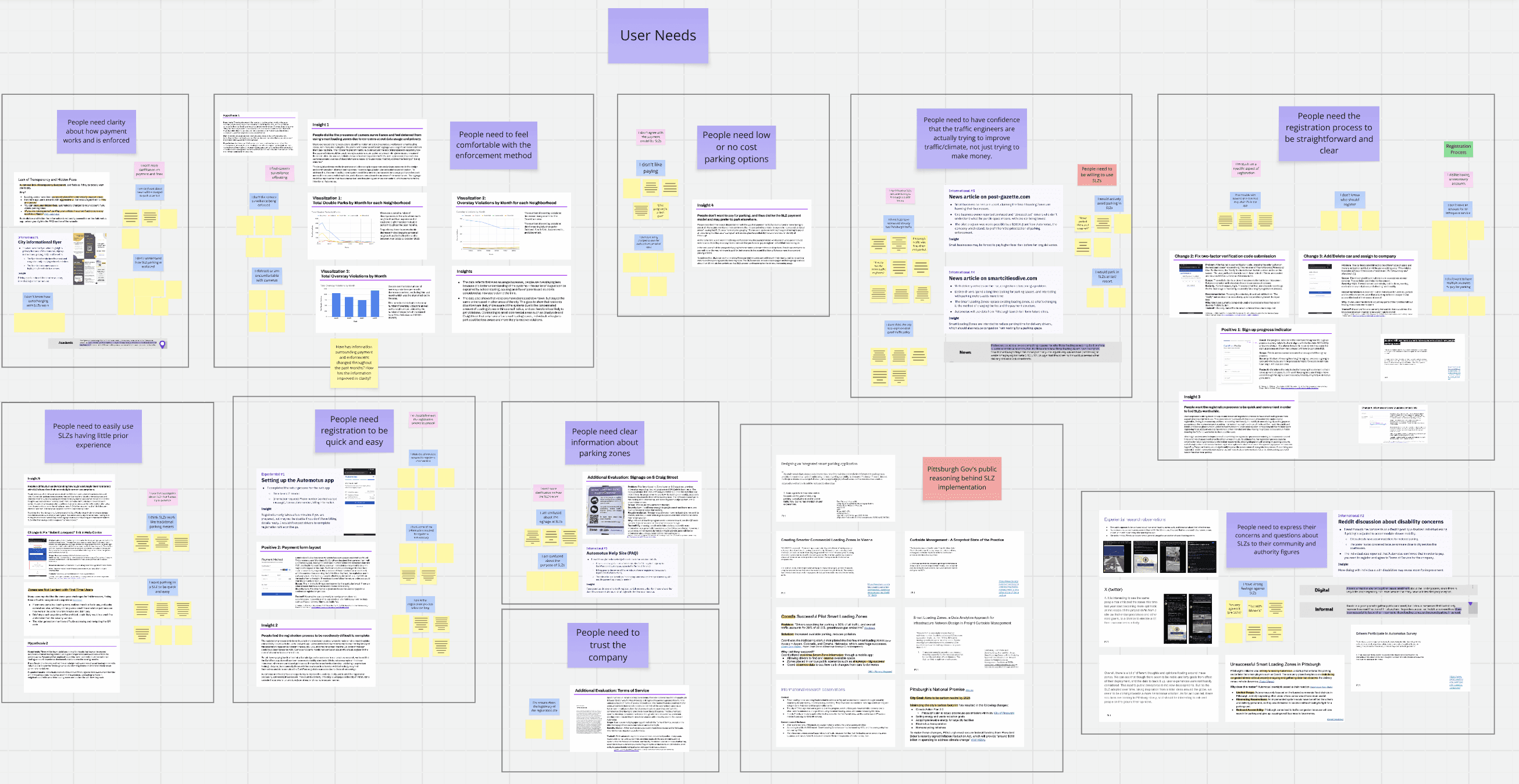
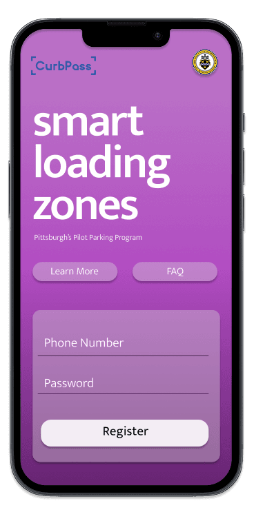
Smart Loading Zones
Redesigning a Mobile and Curbside System to Support Confident Parking Decisions
Smart Loading Zones (SLZs) are part of the City of Pittsburgh’s pilot program to reduce curbside congestion, improve traffic flow, and support sustainability goals through camera enforced, short-term parking. Instead of traditional meters, drivers must rely on curbside signage and a digital registration system to park legally. While the program was designed to increase efficiency and compliance, early adoption revealed a different reality. For many everyday drivers, especially first-time and infrequent parkers, the experience felt confusing, stressful, and disproportionately risky for a task meant to take only a few minutes.
As a UX Research Lead and Product Designer, I investigated why drivers hesitated or avoided Smart Loading Zones, even when they needed to park. Research revealed that uncertainty and enforcement focused messaging increased anxiety at the curb, making disengagement feel safer than participation.
Our team focused our class project on redesigning the end to end parking experience, from curbside encounter to app payment, to support fast, confident decisions without unnecessary commitment or cognitive load. The resulting system prioritized familiar behaviors, reduced perceived risk, and aligned user needs with the city’s operational goals
Year
Jan 2024- May 2024
Skills
Guerilla Interviews
Field Research
Heuristic Evaluation
Rapid Concept Testing
Speed Dating
Figma
Miro
2 Designers
3 Researchers
Team
UX Research Lead
UI Product Designer
Role
oVERVIEW
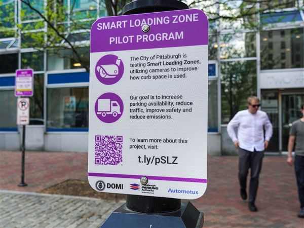
About Smart Loading Zones
Smart Loading Zones were introduced by the City of Pittsburgh as part of a broader effort to reduce curbside congestion, improve traffic flow, and support sustainability goals, including the city’s commitment to becoming carbon neutral by 2030.
While the program was designed to encourage efficient, short-term parking and reduce emissions from circling vehicles, our research showed that usability and trust issues were preventing many users from engaging with the system as intended.
Smart Loading Zones (SLZs) are part of Pittsburgh’s pilot program to manage curbside congestion through camera-enforced, short-term parking. Instead of traditional meters, drivers must rely on physical signage and a digital app registration to park legally. The program was designed to improve traffic flow and support local businesses, but in practice, many everyday drivers found the system confusing, stressful, and difficult to trust.
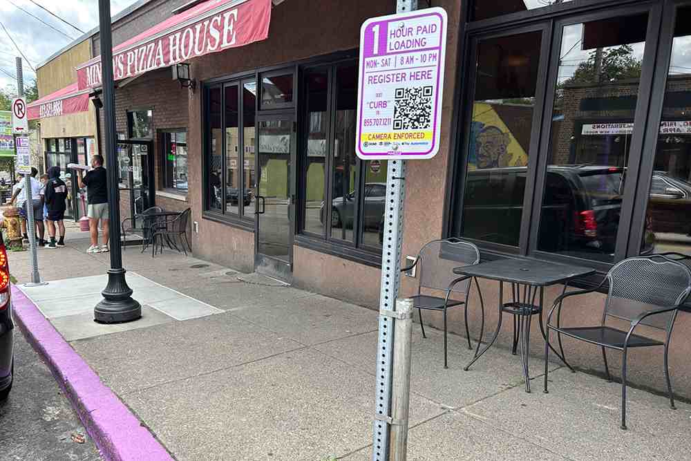
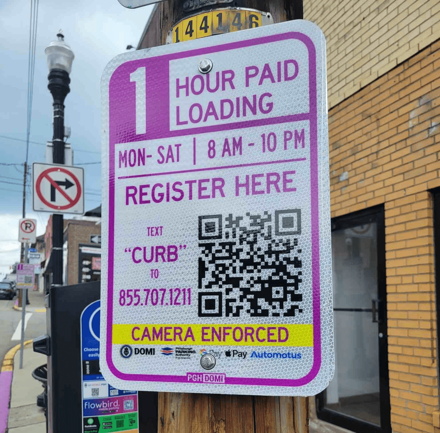
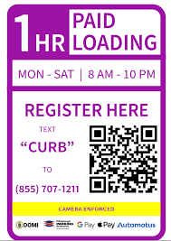
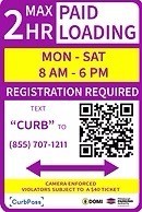
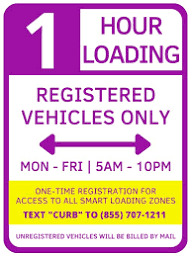
Excerpts of Different Signage at Purple Curbs
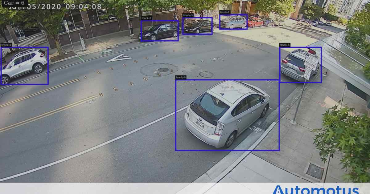
View of Camera Enforcement from Automotus
Purple Curb & SLZ Signage
Overview
Initial Challenge
Despite good intentions, Smart Loading Zones were creating stress rather than parking ease.
First-time and infrequent parkers often encountered SLZs unexpectedly and had to make fast decisions under pressure, while blocking traffic or preparing to exit their vehicle.
At the curb, users struggled to quickly answer basic questions:
Can I park here? How long can I stay? How do I pay? What happens if I park wrong?
The existing experience required users to interpret dense signage, navigate a time-consuming registration flow, and process camera enforcement messaging that felt invasive for such a small task. What was meant to be a quick stop instead felt stressful and high-risk.
As a result, many drivers hesitated, avoided parking altogether, or left feeling uncertain, especially residents, customers, and delivery drivers who needed to park quickly and move on.
Overview
What Research Revealed
Through in-context field research, heuristic evaluation, and rapid concept testing, we began to see a consistent pattern. Rather than supporting fast, confident decisions, the system prioritized enforcement and automation over legibility, reassurance, and speed. This created friction at the exact moment users needed clarity most; when they were rushed, uncertain, and trying not to make a mistake.
When the experience felt unclear, users didn’t have the time to slow down to figure it out. Instead, many chose to disengage entirely, deciding that avoidance felt safer than participation.
INSIGHT #1
INSIGHT #2
Across guerrilla interviews and think-aloud walkthroughs of the existing experience, users consistently struggled to understand where to start, how long registration would take, and whether they were completing the process correctly.
This uncertainty was especially frustrating given the context. Parking felt like it should be quick and low-effort, yet the system demanded attention, time, and confidence users didn’t have in the moment.
During interviews and speed-dating sessions, users consistently reacted negatively to camera enforcement language, expressing unease even when they intellectually understood what data was being collected, suggesting that transparency alone did not translate to trust.
During interviews and speed-dating sessions, users reacted strongly to camera enforcement language. Even when they intellectually understood what data was being collected, explicit explanations often increased discomfort rather than reassurance.
Instead of building trust, enforcement focused messaging made users more aware of the risks of getting something wrong. In a time-pressured public setting, this heightened anxiety and made disengagement feel like the safer choice.
In-context observations showed users scanning signage for pricing, duration, and rules while actively blocking traffic or preparing to exit their vehicle. In these moments, key details were often missed or misinterpreted due to visual overload and poor hierarchy.
When information wasn’t immediately legible, users felt unsure whether they could park at all, increasing hesitation in an already time pressured situation.
Participants repeatedly questioned why a short parking interaction required account creation and personal details. Many described the process as disproportionate to the task, noting that the amount of information requested increased their fear of making a costly mistake.
What felt like a quick, everyday action instead carried the weight of a long-term commitment.
INSIGHT #3
INSIGHT #4
Uncertainty at the curb caused hesitation for a task users
expected to take seconds.
Transparency alone did not
translate to trust, instead
creating discomfort.
Critical parking information
was difficult to find at the
moment it mattered.
A brief parking interaction required more personal information than users felt was justified.
Experience prioritizes fast decisions at the curb
Redesign includes:
Tap-to-Pay as primary action and trusted way to pay
Pricing, duration, and eligibility visible at a ease
Clear next steps towards payment/registration.
Privacy reassurance around camera enforcement
Experience allows for two clear paths:
Pay now or Pay & Register later
Redesign includes:
Reduced steps & less personal information
Optional registration for first-time users
Clear confirmation and improved readability
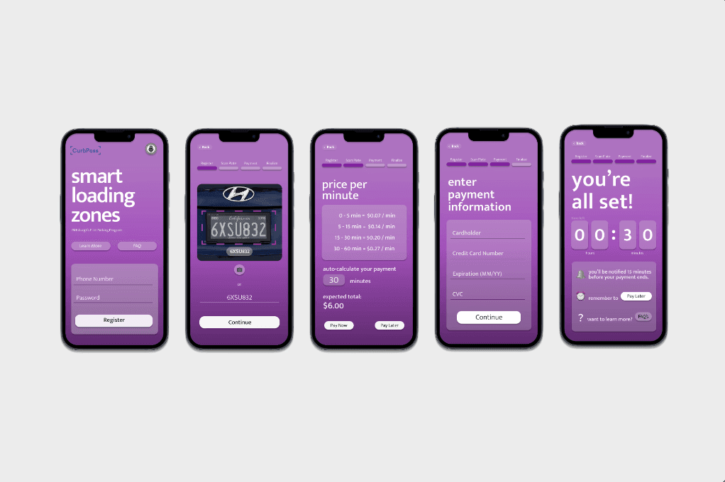
Figma Clickable Prototype
Hi-Fi Signage
Overview
Redesigned Solution at a Glance
This work resulted in a redesigned end-to-end parking experience that prioritizes immediacy, familiarity, and trust at the curb.
Rather than forcing all users into a single registration flow, the system supports different parking behaviors. First-time and infrequent parkers can act immediately through familiar, low-effort interactions, while repeat users still have access to optional registration for convenience.
By reducing cognitive load and perceived risk at the moment of parking, the redesigned experience encourages compliance, supports local businesses, and aligns user needs with the city’s operational goals, without changing the underlying enforcement model.
Redesigned Signage
Hi-Fi App Registration
Research
Research
Approach
Literature
Review
Competitive
Analysis
Class
Observations
Student
Focus Groups
Educator
Focus Groups
Affinity Diagramming
Overview
Reframed Problem & How Might We's
Research and synthesis led us to a reframing that shaped every system decision that followed.
Rather than asking how to improve registration or explain enforcement, we reframed the problem around decision-making at the curb, the moment when users are rushed, uncertain, and most sensitive to risk.
HMW reduce the fear of making a mistake at the curb?
HMW allow drivers to act immediately without forcing registration or long-term commitment?
HMW communicate rules, pricing, and enforcement without increasing anxiety?
How might we…
enable fast, confident decision-making for first-time and infrequent parkers in SLZs while reducing friction, minimizing perceived risk, and maintaining trust in an automated enforcement system?
Supporting HMW's
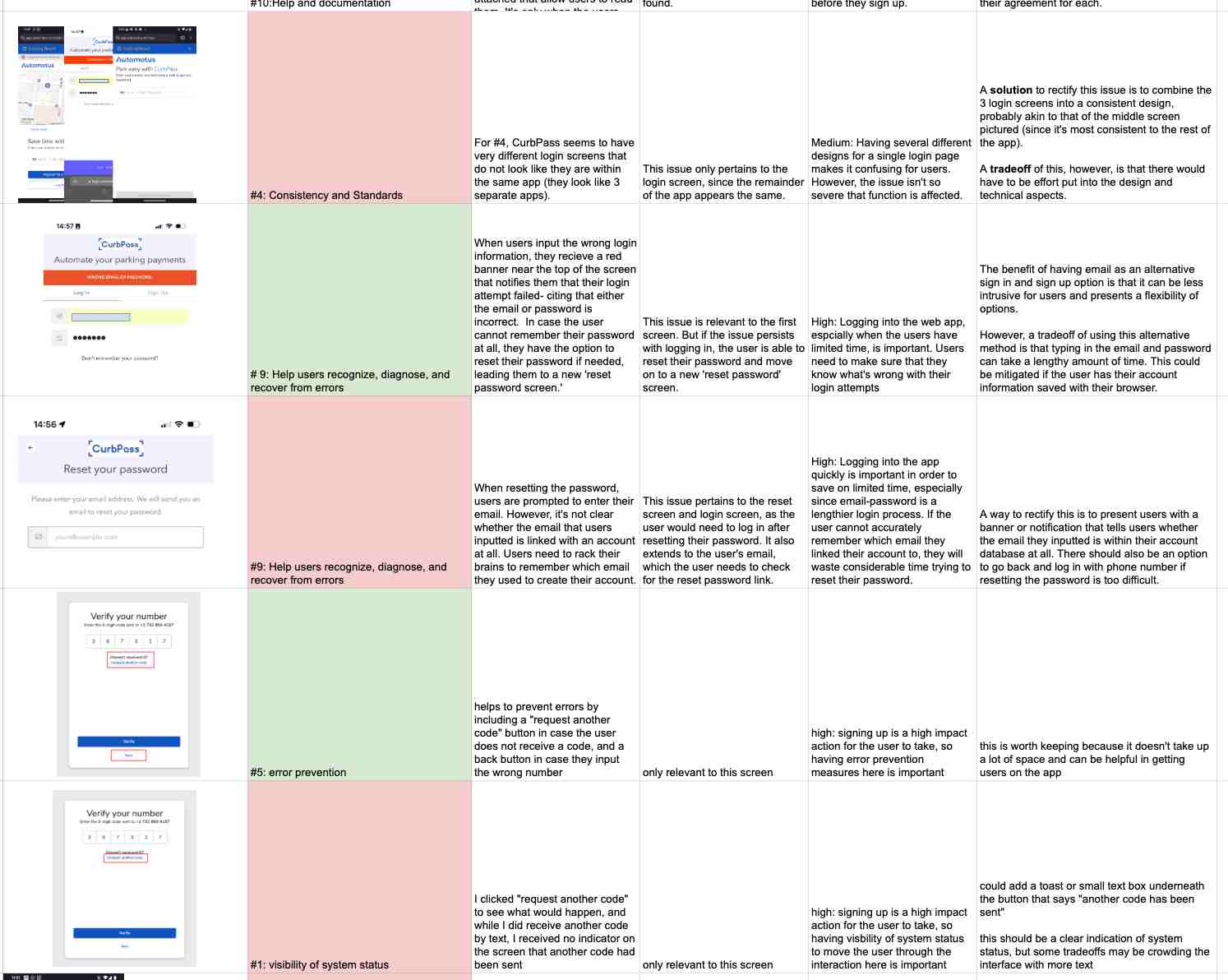
Before involving users, our team conducted a heuristic evaluation of the existing Smart Loading Zone signage and app registration flow to identify usability issues that could prevent users from even attempting to park.
This evaluation surfaced several critical challenges:
These findings helped us understand why users hesitated before ever trying to park, and guided what we paid closer attention to during field research.
Heuristic Evaluation
Research
Excerpt from our Heuristic Evaluation Assignment.
Red for negative impact, Green for positive impact.
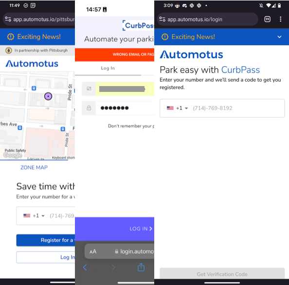
There are three different login pages reachable from different links and QR codes, and they don’t ask for the same information. This fragmentation makes the experience feel like a set of disconnected services rather than a single, official flow
Without a clear starting point, users are left unsure whether they are in the right place or completing the correct steps.
INSIGHT #2
Users don’t have clear “entry” into the parking registration system
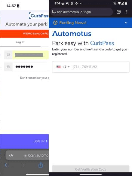
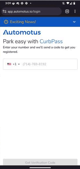
After entering a two-factor authentication code, pressing “enter” does nothing, and the “Verify” button is placed below the fold. Users must discover this through trial and error, often assuming the system is broken.
This breakdown was marked high severity because users can’t proceed without discovering the hidden action, increasing frustration and uncertainty mid-flow.
INSIGHT #3

The verification step blocks progress in a way users don’t expect
When adding a vehicle, there is no visible back or exit option, and vehicle information isn’t clearly tied to different user contexts or jobs. This breaks basic expectations of “let me undo” or “let me leave.”
Without a clear escape, users feel stuck — a particularly risky feeling in a system tied to enforcement and potential fines.
INSIGHT #4
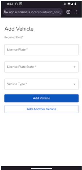
Key account tasks trap users with no clear way out or "undo" control.
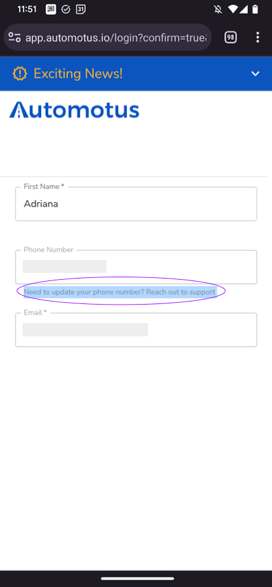
Users can’t change their email or phone number without contacting support, and the interface doesn’t clearly explain how to do so.
In the Help Center, a “Submit a request” button goes to a 404, while the working version is hidden in a menu. This makes error recovery feel opaque and inaccessible, further eroding trust in the system.
INSIGHT #5
Updating contact info is hard to access.
Verification step blocks progress
Unreliable or inaccessible help
Loss of user control mid-flow
Curbside signage didn’t support first-time action
In a time-pressured curbside moment, these breakdowns not only slow users down, they increase perceived risk and undermine trust, making avoidance a rational choice.
A sign in an SLZ provides pilot information and a QR code, but doesn’t explain how the loading zone works for drivers. Instead of helping users understand whether they can park, for how long, or what to do next, the QR code leads directly to a sign-up page rather than a “learn more” experience.
For first-time parkers, this creates confusion before they even decide whether to engage with the system.
INSIGHT #1
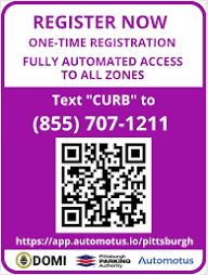
The curb signage doesn’t answer the first-time questions people actually have
Too many unclear entry points into the system
Overview
About SLZs
Initial Challenge
Stakeholders
Research Synthesis
How Might We
Solution
Drivers wanted to park quickly without worrying about getting a ticket later.
Unclear steps made people hesitate or avoid parking altogether.
Overview
Pivotal Research Insights
During in-context interviews near active Smart Loading Zones, we observed that first-time parkers often hesitated or avoided parking altogether, even when they needed the spot, because they were unsure how to pay, how long they could stay, or what would happen if they made a mistake.
Further qualitative research confirmed this was not an isolated experience.
Across guerrilla interviews, heuristic evaluation, and concept testing, users consistently described the experience, from curbside signage to app registration, as unclear, unforgiving, and risky.
What we repeatedly heard from participants:
Paying for a short park felt harder than it needed to be.
In time-pressured public systems, uncertainty feels punitive. When the cost of being wrong feels high, users disengage rather than risk being penalized.
We began by reviewing existing documentation and public information about Pittsburgh’s Smart Loading Zone pilot to understand how the program was designed and what it was intended to achieve.
This context helped us frame our later research and informed the questions we asked in the field.
In particular, we surfaced three important tensions shaping the system:
Understanding these constraints allowed us approach the problem with empathy, not only for drivers, but also for the city stakeholders responsible for implementing and maintaining the system.
Background Research & Secondary Research
Research
The city’s focus on automated enforcement and operational efficiency
Ongoing public frustration and confusion with the program
Community concerns around usability, trust, and surveillance
Research
Research Approach
To understand why Smart Loading Zones were struggling to gain adoption, our team conducted a multi-phase research effort focused on the first-time parking experience, especially moments of confusion, hesitation, and decision-making at the curb.
Rather than focusing only on pain points within app registration, we studied the entire experience, from encountering curbside signage to attempting registration and payment. This allowed us to see where users felt rushed, uncertain, or uncomfortable, and how those feelings shaped real parking decisions.
Our research combined background review, evaluation of the existing system, and direct conversations with people using or affected by Smart Loading Zones.
How do people encounter Smart Loading Zones in their everyday routines?
What information do users notice first in time-pressured moments?
Where does the experience break down? At the curb, in the app, or both?
Research Goals
often encountered SLZs unexpectedly and had to make quick decisions under pressure. When the system felt unclear or risky, many chose to avoid parking altogether.
depended on SLZ adoption to manage curbside congestion and enforce parking rules. When usability issues limited adoption, both enforcement efficiency and public trust were affected.
Overview
Clients & Stakeholders
Smart Loading Zones sit at the intersection of public infrastructure, local commerce, and everyday life. Because of this, the experience impacted far more than individual drivers.
relied on short-term parking to support walk-in customers. Confusion and fear of camera enforcement led some customers to avoid SLZ curbs, reducing foot traffic and impacting daily business.
experienced broader effects on accessibility, economic vitality, and trust in smart city initiatives when parking systems felt confusing or punitive rather than supportive
Drivers & First-Time Parkers
City & Program Administrators
Local Shop Owners & Workers
Local Community
Field Observations & Guerilla Interviews
Research
While the heuristic evaluation showed where the experience broke down, in-context guerrilla interviews revealed why.
We conducted short, informal interviews near active Smart Loading Zones with drivers, pedestrians, and nearby shop workers. These conversations were intentionally brief, allowing us to capture natural reactions without interrupting people’s routines.
Our goal was to observe how users interpreted signage, reacted to enforcement language, and made parking decisions under real-world pressure — especially when encountering Smart Loading Zones for the first time.
Across interviews, a clear pattern emerged: people wanted to park quickly and confidently, but uncertainty and perceived risk made disengagement feel safer than participation.
Purple Smart Loading Zone Curb in Squirrel Hill
We conducted short, in-context interviews near Smart Loading Zones with:
First-time & infrequent parkers
STAKEHOLDERS
Drivers who decided to park
Shop workers affected by SLZs
Who We Spoke With
We asked participants to walk through their experience in real time, focusing on what they noticed, how they interpreted the signage, and what influenced their decision to park or leave.
INTERVIEW PREP
What do you notice first when you see the curb?
What do you think you’re supposed to do next?
What would make you decide to leave instead?
What makes you feel comfortable / uncomfortable parking here?
How We Conducted Guerilla Interviews
Across interviews, several consistent behaviors emerged:
Even tech-savvy users expressed discomfort when the system felt unforgiving or high-risk for a short parking task.
OBSERVATIONS
INSIGHT #1
INSIGHT #2
INSIGHT #3
What We Observed
People felt rushed while trying to understand the rules, often while blocking traffic.
Unclear signage and multiple steps increased hesitation to park & pay.
Fear of making a mistake under surveillance or receiving a ticket led some users to avoid parking altogether.
These observations validated and extended what we saw during the heuristic evaluation:
Importantly, this research helped us recognize that avoidance was a rational response, not user error.
VALIDATING INSIGHTS
Confusing entry points translated into real hesitation
Enforcement-focused language increased anxiety in the moment
Lack of immediate clarity made avoidance feel like the safest option
How This Built on the Heuristic Evaluation
Synthesis
Transition to System Design
Synthesis clarified where the experience was breaking down and what the system needed to do differently. The next step was translating these insights into a system architecture that could reduce hesitation at the curb and support fast, confident parking decisions at scale.
System Design
About BootUp
Initial Challenge
Research Synthesis
Reframed Challenge
How Might We
Solution
Reflection
Reflection
This project marked my first end-to-end experience conducting primarily qualitative user research, and it completely shaped how I think about research, collaboration, and design.
At the start of the course, I set learning goals around strengthening my research practice, working effectively within a multidisciplinary team, and improving how I interact with participants. Looking back, I’m proud not only of how much I learned, but of how deeply I was able to apply those skills throughout the course project.
Working through in-context research, think-aloud protocols, Walk the Wall, and affinity diagramming pushed me to move beyond surface-level insights and develop a deeper understanding of user behavior. Observing how people thought, hesitated, and made decisions in real time helped me recognize patterns that weren’t always visible through direct questioning.
One of my biggest areas of growth came from interacting with participants. Through trial and error, feedback from teammates, and continuous reflection, I became more comfortable guiding conversations, asking clearer questions, and minimizing bias. Over time, I could see serious improvement in how participants engaged and in the quality of insights we gathered.
This project also taught me the importance of prioritizing observation over verbal explanation. Watching participants navigate uncertainty, especially in time-pressured environments, often revealed more than what they could articulate afterward. Learning to pay closer attention to behavior helped me adapt my research approach in the moment and ask better follow-up questions.
More than anything, this experience showed me how meaningful it can be to design and refine solutions that genuinely support a community. Completing this project reinforced my confidence in pursuing user research and clarified the kind of work I want to continue doing: really thoughtful, human-centered research that helps people navigate with greater ease and confidence.
Strengthening my User Research Practice
Active Listening with Participants
Field Observations in Real Time
Reaffirmed my Love of UXR and Product Design!!!
Evolved Goals & Final Outcome
This work demonstrates how small shifts in system design, especially at the curb, can significantly reduce hesitation and improve compliance without changing enforcement rules. By supporting fast, confident decisions, the redesigned experience better aligns user needs with the city’s operational goals.
System design
Reflection
My Thoughts
Thank you for browsing :)
Interested in learning more? Please feel free to reach out on LinkedIn or my email!
Team Brainstorming
Walk the Wall
Affinity
Diagramming
Design
Opportunities
Revised HMWs
Crazy 8's
Concept
Selection
Synthesis
Research Insights —> Synthesis
Research
While the heuristic evaluation showed where the experience broke down, guerrilla interviews revealed why:
people wanted to park quickly and confidently, but uncertainty and perceived risk made disengagement feel safer than participation.
This understanding set the foundation for our synthesis & directly informed how we reframed the problem.
Team Brainstorming
SYNTHESIS
Immediately following our interviews, we held interpretation sessions to review notes while conversations were still fresh. Each team member shared moments of confusion, hesitation, or unexpected behavior they observed in the field.
Our goal during synthesis was not just to summarize insights, but to understand why people hesitated or disengaged, and what the system needed to do differently to support confident action at the curb.
These sessions allowed us to step back from individual interviews and begin identifying patterns across participants and locations. By discussing what surprised us and where users struggled most, we started to distinguish between surface-level usability issues and deeper behavioral barriers.
Walk the Wall (Affinity Diagramming)
Synthesis
After completing our interpretation sessions, we synthesized observations using a Walk the Wall approach. We externalized notes from interviews, field observations, and heuristic evaluation to see the data all at once.
By grouping observations through affinity diagramming, we were able to see that confusion was not isolated to a single screen or step, but distributed across the entire curbside experience, from first encountering signage to completing payment. Notes were grouped based on similarity, allowing themes to emerge naturally without forcing categories too early.
Through this process, our team identified four core themes that consistently shaped user behavior.
Affinity diagramming from Field Observations
THEME #1
“I just don’t want to do something wrong and get fined later”
- First Time Parker
"It's a lot of work, and I just wanted it to be quick" - Local Citizen
Across interviews and observations, users hesitated or avoided parking because they were unsure what would happen if they made a mistake. In time-pressured curbside environments, this uncertainty made parking feel risky rather than convenient.
Uncertainty at the curb caused users to delay or avoid parking entirely
THEME #2
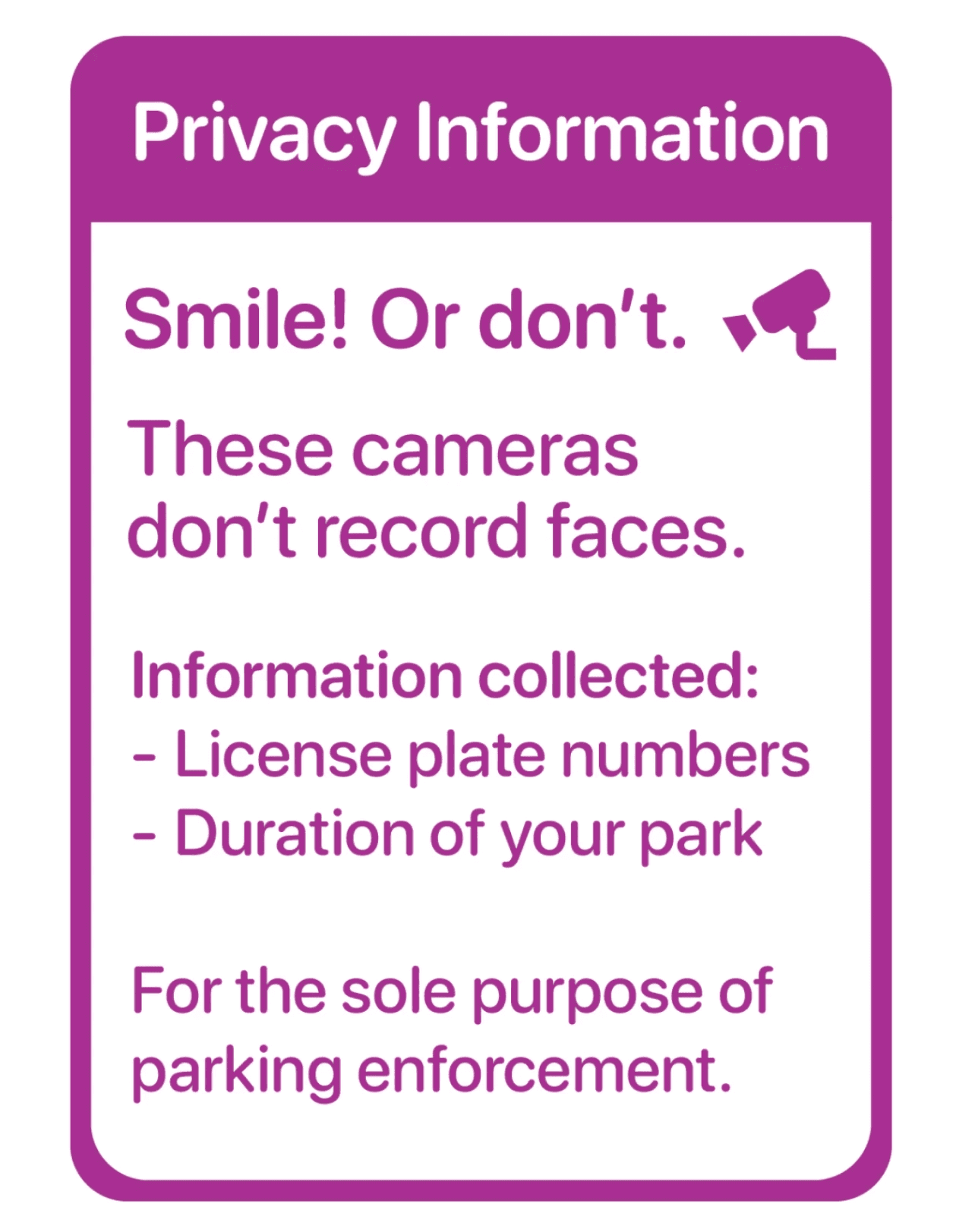
"[The signage] trying to tell me that '[we're] not collecting much data' actually makes me feel more uncomfortable.”
"I don't trust that the cameras are not collecting other data"
- Local Business Owner
One of the most important synthesis insights was that more information did not always make users feel better. Detailed explanations of camera enforcement often heightened concern rather than reduced it.
Users were especially uneasy when systems tried to reassure them by listing exactly what data was being collected. This challenged our early assumption that clearer explanations alone would build trust and revealed that reassurance needed to come from familiar, low-effort interactions instead.
THEME #3
“I thought this was only for loading or deliveries.” - Local Citizen
"I thought SLZs were specially reserved, kind of like a handicap" - First Time Parker
Curbside signage did not clearly answer users’ first questions: Can I park here? How long? How much? What do I do next? Many users interpreted SLZs as restricted or enforcement-only zones.
Since many users didn’t understand the zone before engaging digitally, they never entered the system at all. This highlighted signage, not the app, as the initial, critical pain point.
THEME #3
“I thought this was only for loading or deliveries.” - Local Citizen
Curbside signage did not clearly answer users’ first questions:
Can I park here? How long? How much? What do I do next?
Many users interpreted SLZs as restricted or enforcement-only zones. Because they never fully understood the zone at the curb, they disengaged before ever scanning a QR code or opening the app.
Signage failed to support first-time understanding
THEME #4
"The app is requesting too much of my personal information for a simple parking transaction" - First-Time Parker
“They want my number, my address, my email, full name… I'm confused why this is necessary for parking.” - First Time Parker
Users were surprised by how much information and effort was required for a short parking interaction. Account creation, verification, and personal data felt disproportionate to the task.
Treating every user as a repeat customer excluded important workflows for first-time and infrequent parkers and increased fear of making a costly mistake.
The registration asked for more personal information than users expected
Transparency did not equal trust and sometimes increased discomfort
How might we…
help first-time and infrequent drivers quickly understand and use Smart Loading Zones, so they can park with confidence instead of hesitation?
Synthesis
Smart Loading Zones ask drivers to make fast decisions in public, high-pressure moments. When it’s unclear what to do, how long they can park, or what happens if they make a mistake, the system feels risky rather than helpful. As a result, many drivers hesitate or avoid parking altogether, even when they need the spot.
This reframing guided how we defined acceptable solutions.
How might we reduce fear of making a mistake at the curb?
HMW reduce fear of making a mistake at the curb?
HMW allow drivers to act immediately without forcing registration or ongoing commitment?
HMW communicate rules, pricing, and enforcement without increasing anxiety?
Revised Problem Statment & Summarized HMW
Supporting HMWs
After the Walk the Wall, we used these themes to narrow the problem space and identify opportunity areas grounded directly in observed behavior. Rather than jumping to solutions, we focused on what the system needed to enable for users at the curb.
From synthesis, four core opportunity areas emerged:
Users avoided SLZs when the cost of being wrong felt too high (e.g. monetary fine).
Synthesis
OPPORTUNITY #1
Parking decisions needed to work in seconds,
not minutes.
OPPORTUNITY #2
Users needed to understand eligibility, pricing, and duration before scanning a QR code or registering.
OPPORTUNITY #3
First-time and infrequent parkers wanted to complete a single action, not commit to an ongoing account.
OPPORTUNITY #4
These opportunity areas became the opportunities that guided all subsequent system design thinking.
Insights —> Design Opportunities
Support fast, confident decisions in public, time-pressured contexts
Reduce perceived risk at the
moment of parking
Match system effort required
to user intent.
Make the signage legible before asking for action
Synthesis
Crazy 8's
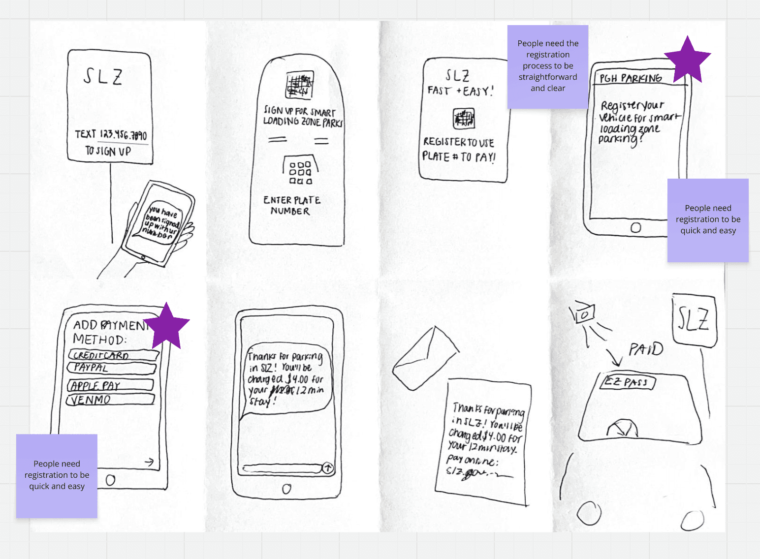
Using these HMWs, the team moved into ideation using the Crazy 8’s method. For each HMW, team members rapidly generated ideas to explore the breadth of possible solutions before converging.
To make sense of the large volume of ideas, we grouped concepts into broader solution categories. These exercises allowed us compare different orders of decision-making, not just different interface ideas.
Excerpts of Team's Crazy 8's
Using these HMWs, the team moved into ideation using the Crazy 8’s method. For each HMW, team members rapidly generated ideas to explore the breadth of possible solutions before converging.
To make sense of the large volume of ideas, we grouped concepts into broader solution categories and evaluated them based on:
Alignment with BootUp’s values
Potential impact on educator and student needs
Feasibility within the project timeline
Through team voting and discussion, ideas were consolidated into three primary solution categories.
Synthesis
Speed-Dating & Concept Selections with User Feedback
Using these opportunity areas, we tested several approaches through speed-dating of storyboards. Rather than asking users what they preferred, we focused on how quickly concepts felt understandable and safe.
Across sessions, users consistently responded more positively to concepts that:
Looked like familiar parking systems
Used known interactions (Tap-to-Pay, existing city apps, EZ-Pass-like models)
Required little to no setup at the curb
These concepts reduced the mental cost of parking and made Smart Loading Zones feel safer and more familiar — without changing the underlying enforcement model.
“This is the best idea. So quick and so easy… it’s like getting on the bus.”
— Participant feedback on Tap-to-Pay
Using these HMWs, the team moved into ideation using the Crazy 8’s method. For each HMW, team members rapidly generated ideas to explore the breadth of possible solutions before converging.
To make sense of the large volume of ideas, we grouped concepts into broader solution categories and evaluated them based on:
Alignment with BootUp’s values
Potential impact on educator and student needs
Feasibility within the project timeline
Through team voting and discussion, ideas were consolidated into three primary solution categories.
Storyboard Excerpt
SYSTEM DESIGN
Translating Insights into a Scalable Parking Experience
With synthesis complete, we moved into system design to address a core challenge: how to restructure the Smart Loading Zone experience so drivers could act quickly and confidently, without needing to fully understand or trust the system upfront.
Rather than focusing on isolated screens or features, we redesigned the end-to-end experience, from curbside encounter to payment to reassurance, so each part worked together to reduce hesitation and perceived risk. The goal was not to explain more, but to support better decisions in the moment.
SYSTEM DESIGN
Approach to Designing the System
One key shift in our approach was recognizing that the app alone could not solve the problem. Many users never reached the app because confusion and hesitation happened earlier—at the curb.
As a result, we treated the experience as a multi-part system, made up of:
Physical signage
Payment interaction
Optional digital support
Trust and reassurance cues
Designing across these elements allowed us to support and optimize the full parking journey.
SYSTEM DESIGN
Entry Point: Reframing the Curbside Experience
Synthesis showed that users often made their parking decision before scanning a QR code. When signage failed to clearly communicate eligibility, pricing, and duration, users disengaged immediately.
We also found that users consistently responded better to familiar, low-effort interactions. Account creation and registration felt disproportionate to short parking tasks and increased hesitation rather than confidence.
This reframing shifted our focus from “getting users into the app” to supporting next step decisions at the curb.
Existing signage emphasized enforcement and registration, making it difficult for first-time drivers to quickly understand whether they could park and what to do next.
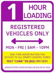
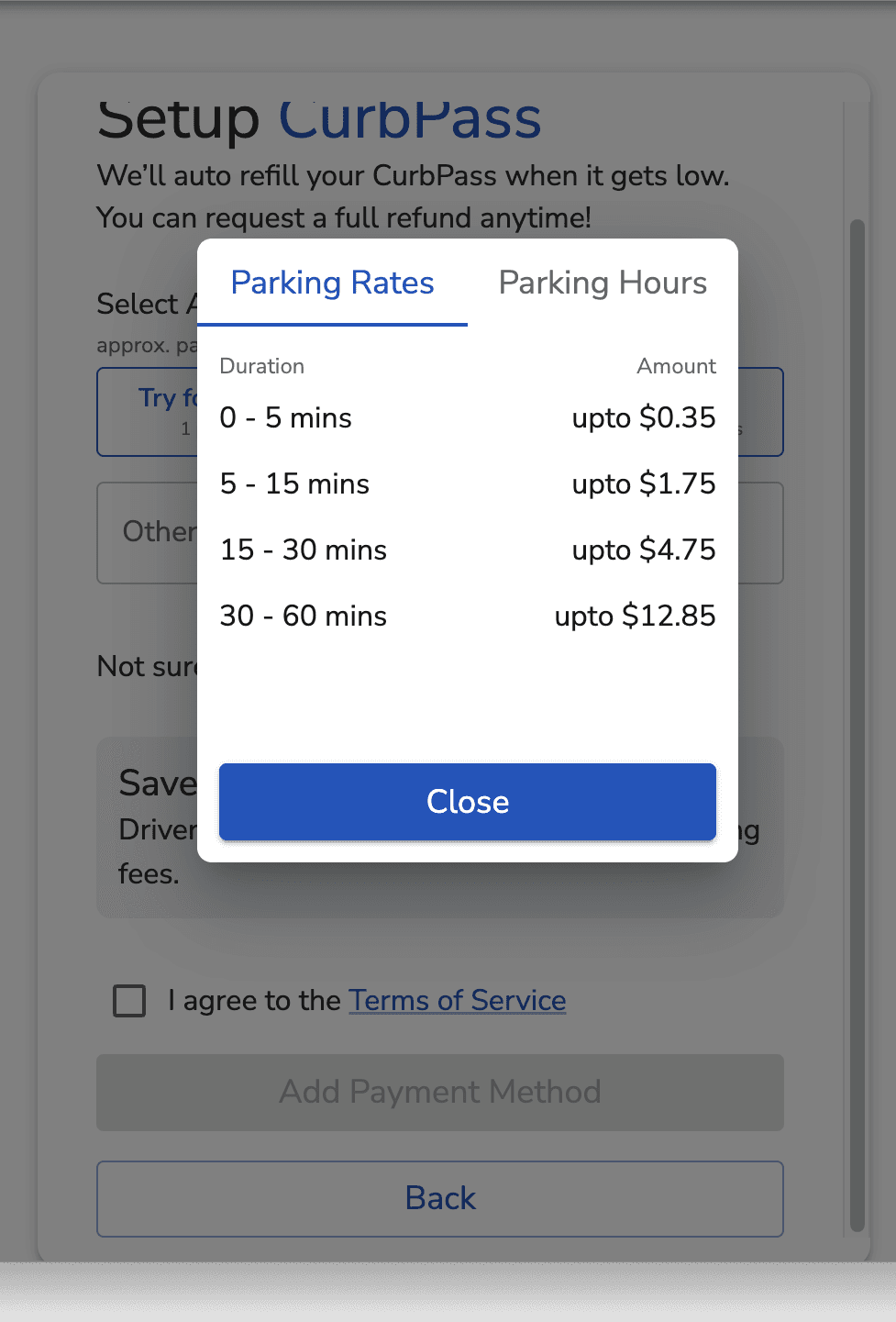
We redesigned curbside signage to:
Clearly state that regular drivers are allowed to park
Surface pricing and time limits at a glance
Present a single, obvious next action
This shifted signage from an enforcement notice to a decision-support tool.
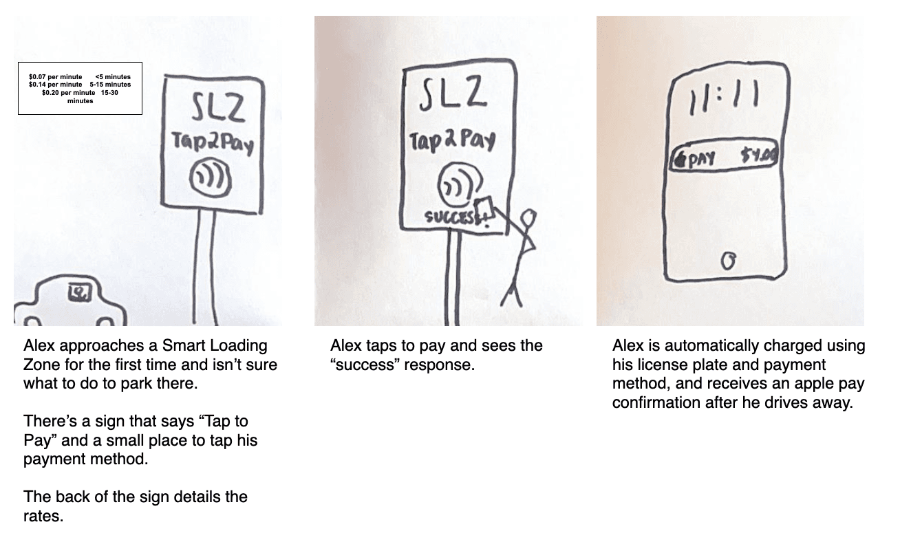
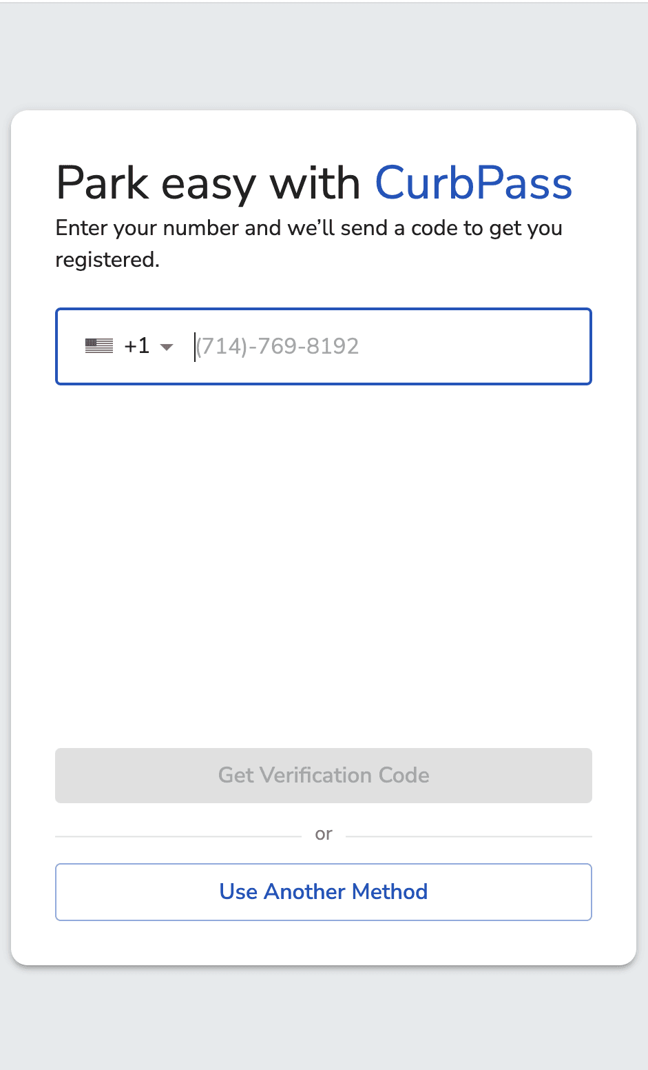
We introduced a Tap-to-Pay interaction that allowed users to pay immediately without:
Creating an account
Entering personal details
Committing to future use
This mirrored familiar transit and parking behaviors users already trusted.
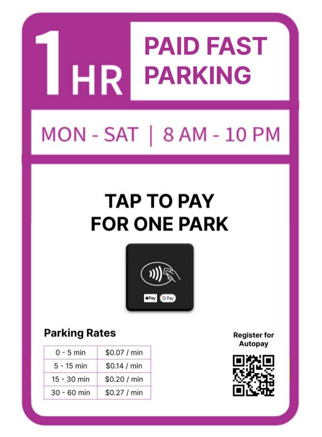
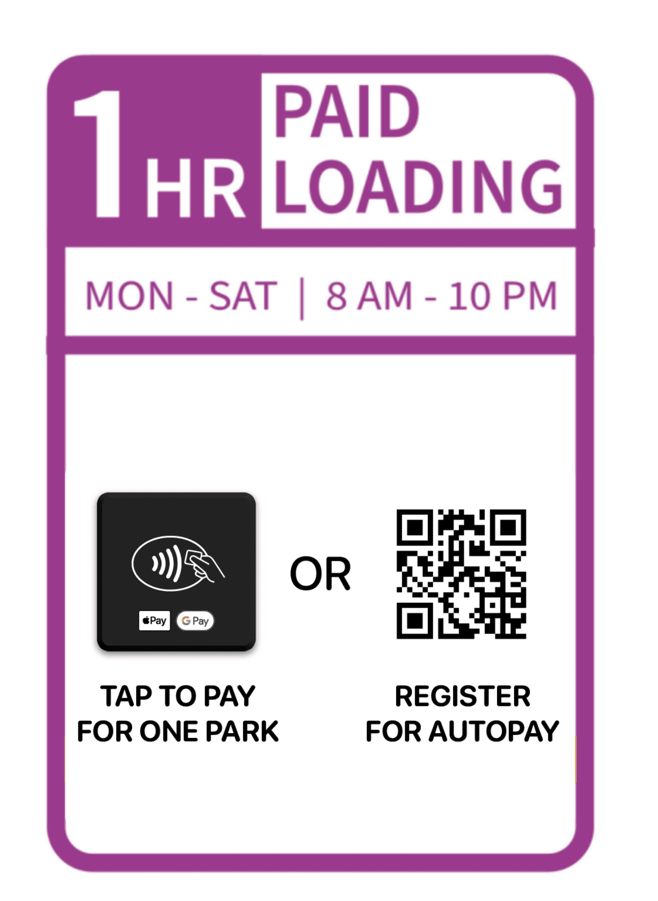
Original Entry Point
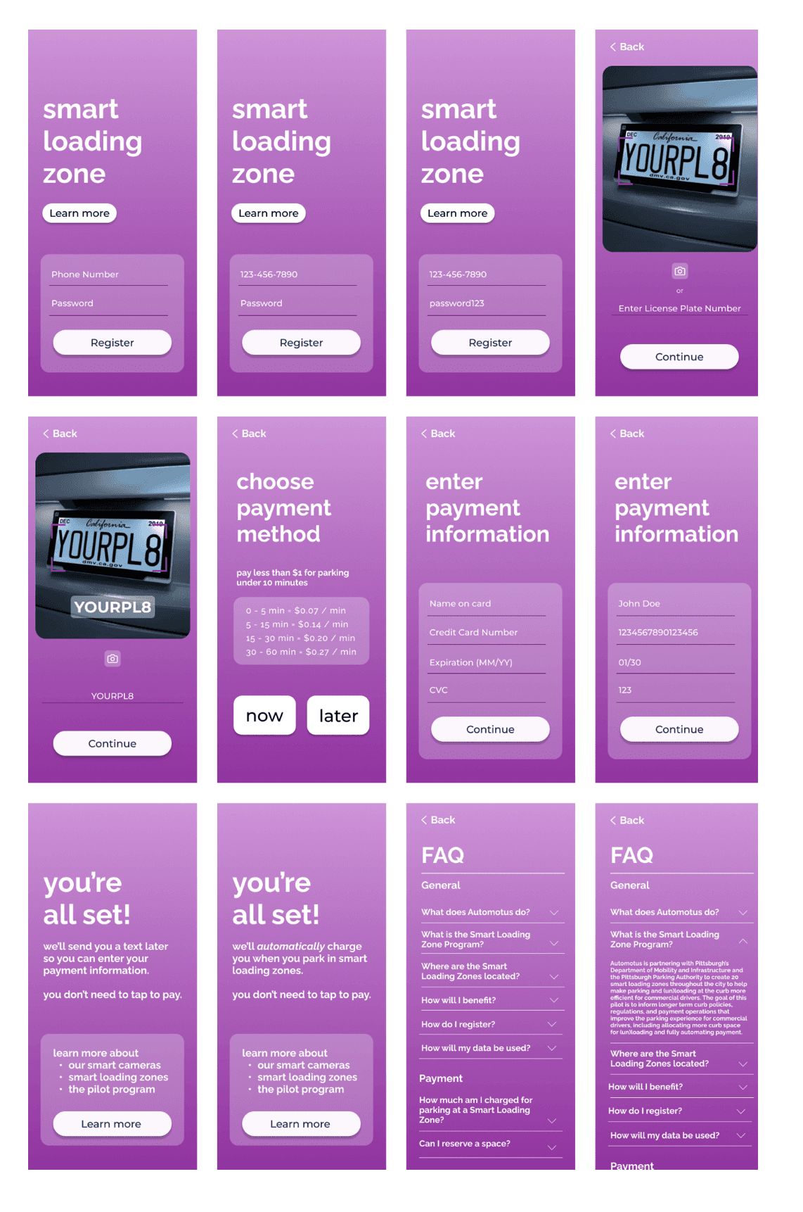
Lo-Fi Prototype of Redesigned Signage
SYSTEM DESIGN
Registration: Reframing the Parking Registration Process
Synthesis showed that users made their parking decision before scanning a QR code. When registration felt unavoidable or unclear, users disengaged early. Rather than removing registration entirely, we reframed it as optional and secondary, supporting frequent users without blocking first-time or infrequent drivers. This allowed us to match system effort to user intent.
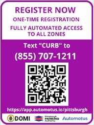
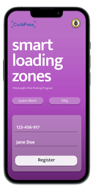
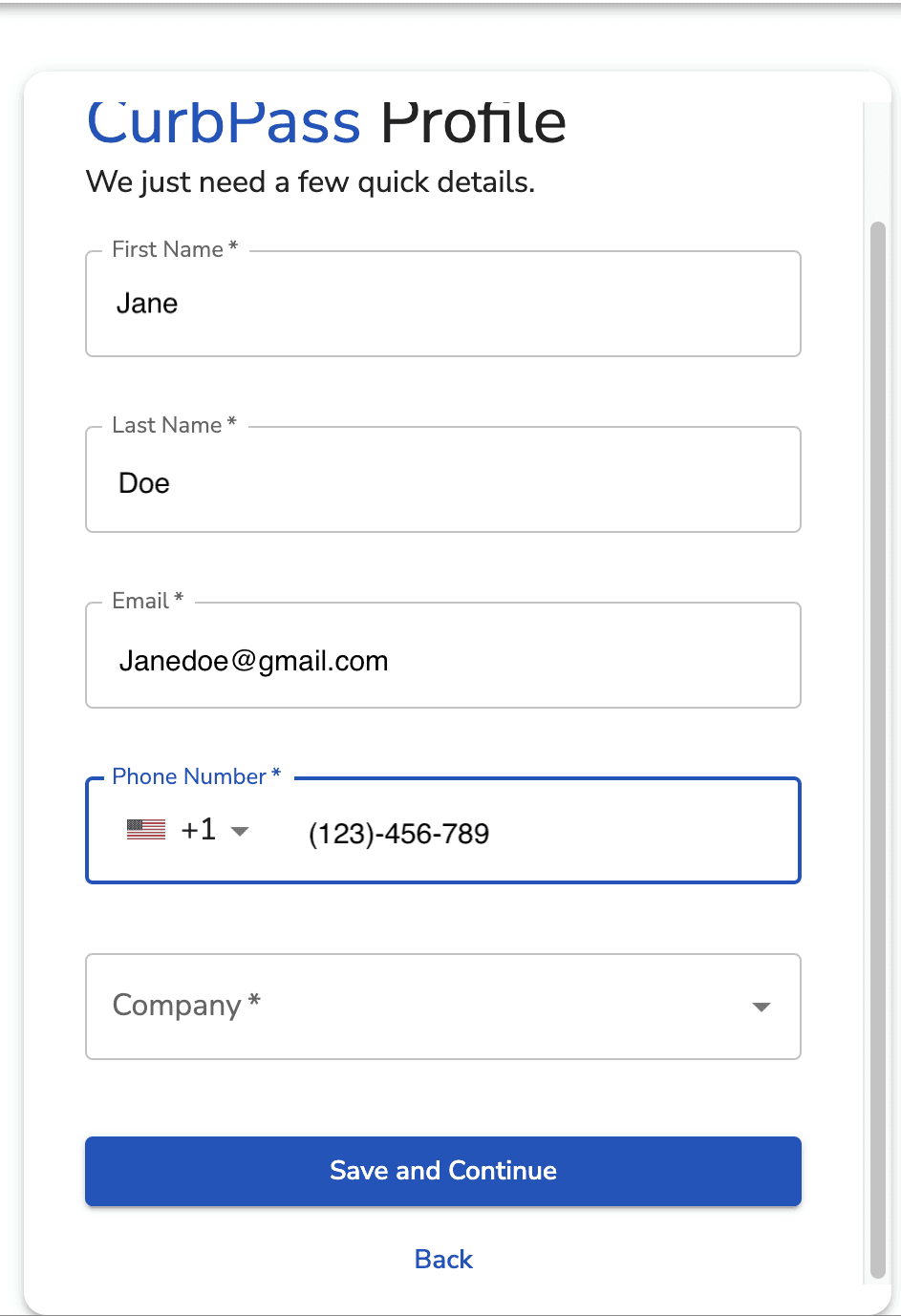
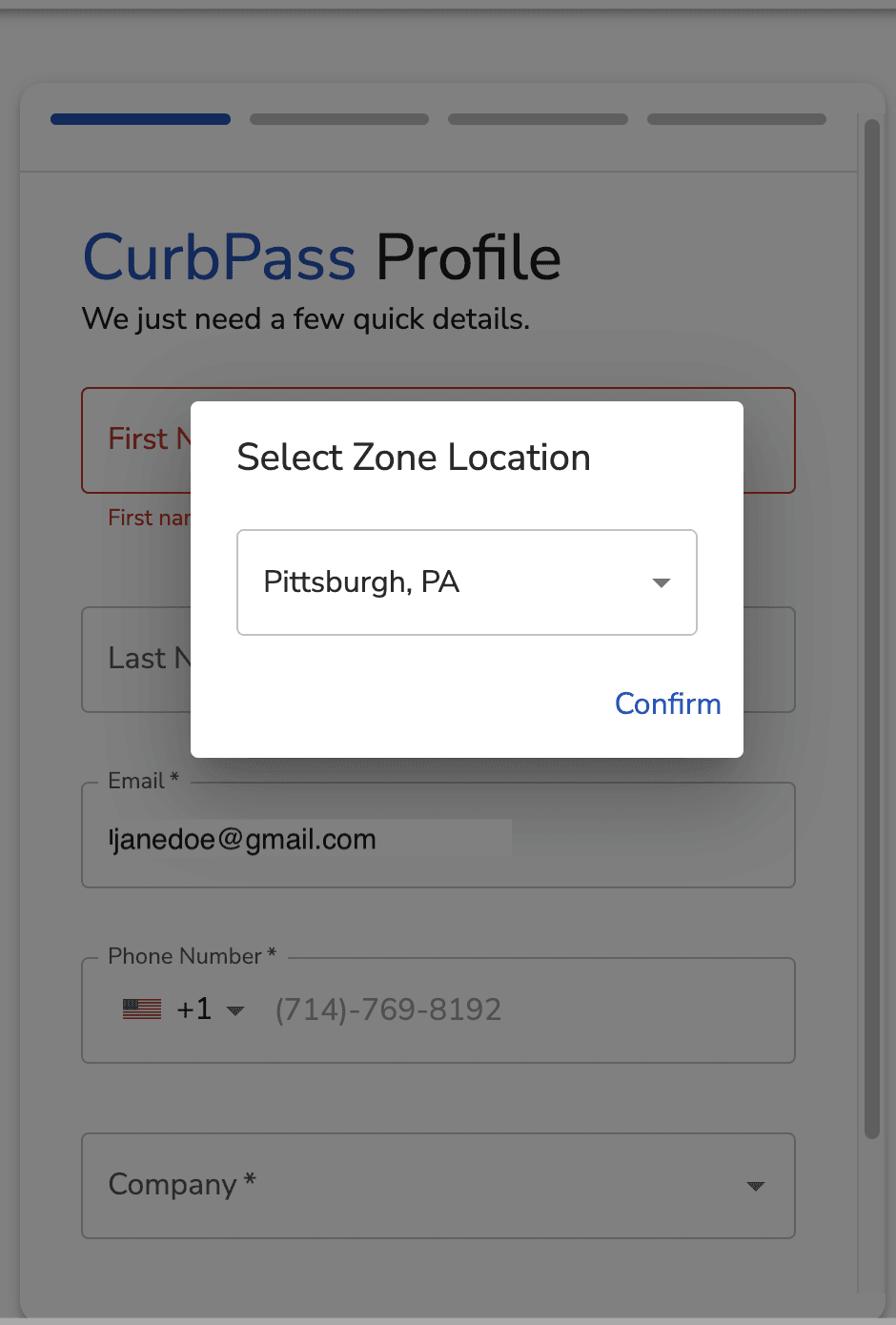
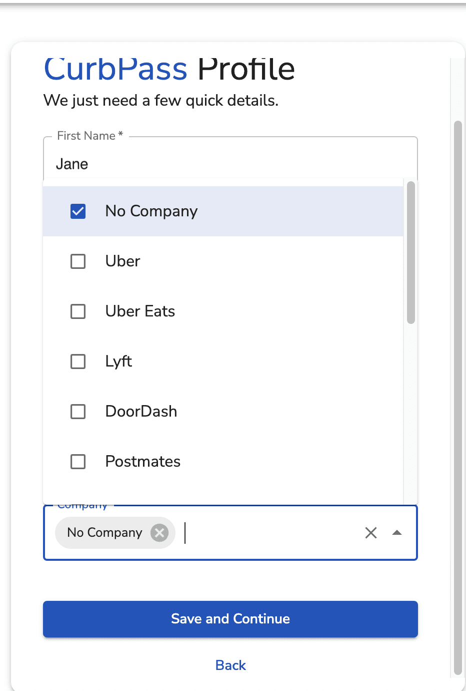
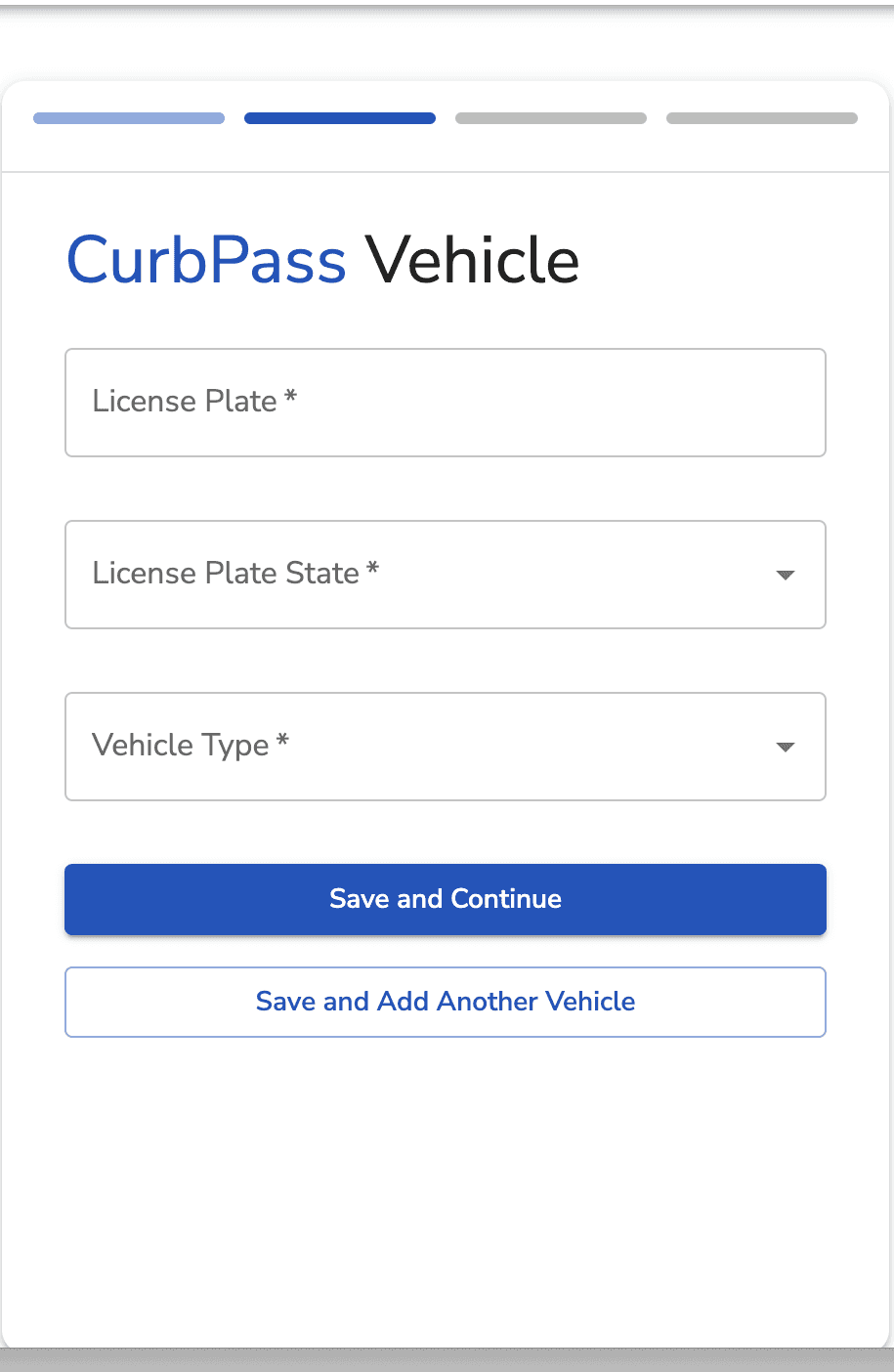
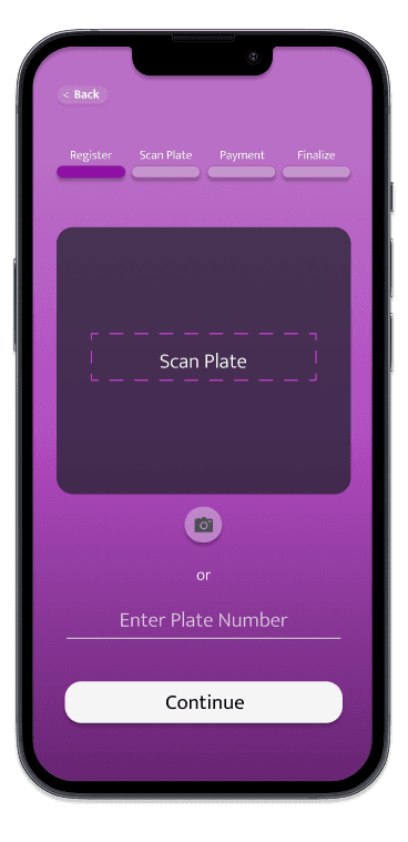
We prototyped a revised registration experience accessed via QR code. The redesigned flow clearly presented two paths:
Pay immediately
Register for future use
The registration flow requested less information and reduced steps, making it faster and more proportional to the task. This supported users who wanted convenience over time, without forcing commitment in the moment.
Original Entry Point
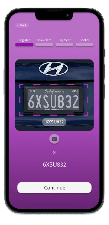
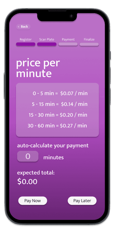
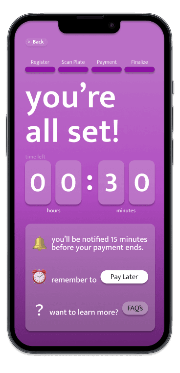
Lo-Fi Prototype of Redesigned Application
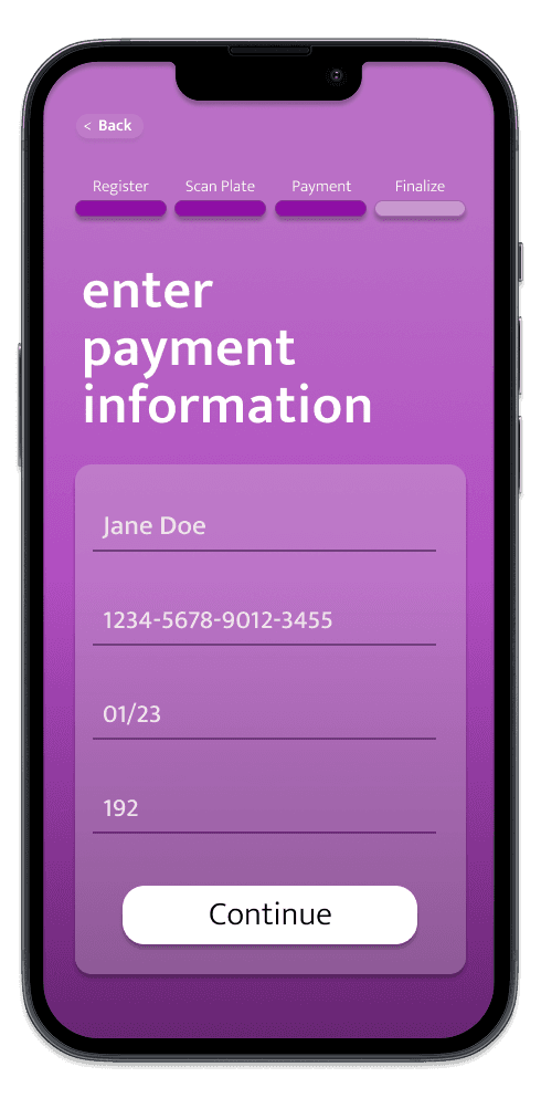
SYSTEM DESIGN
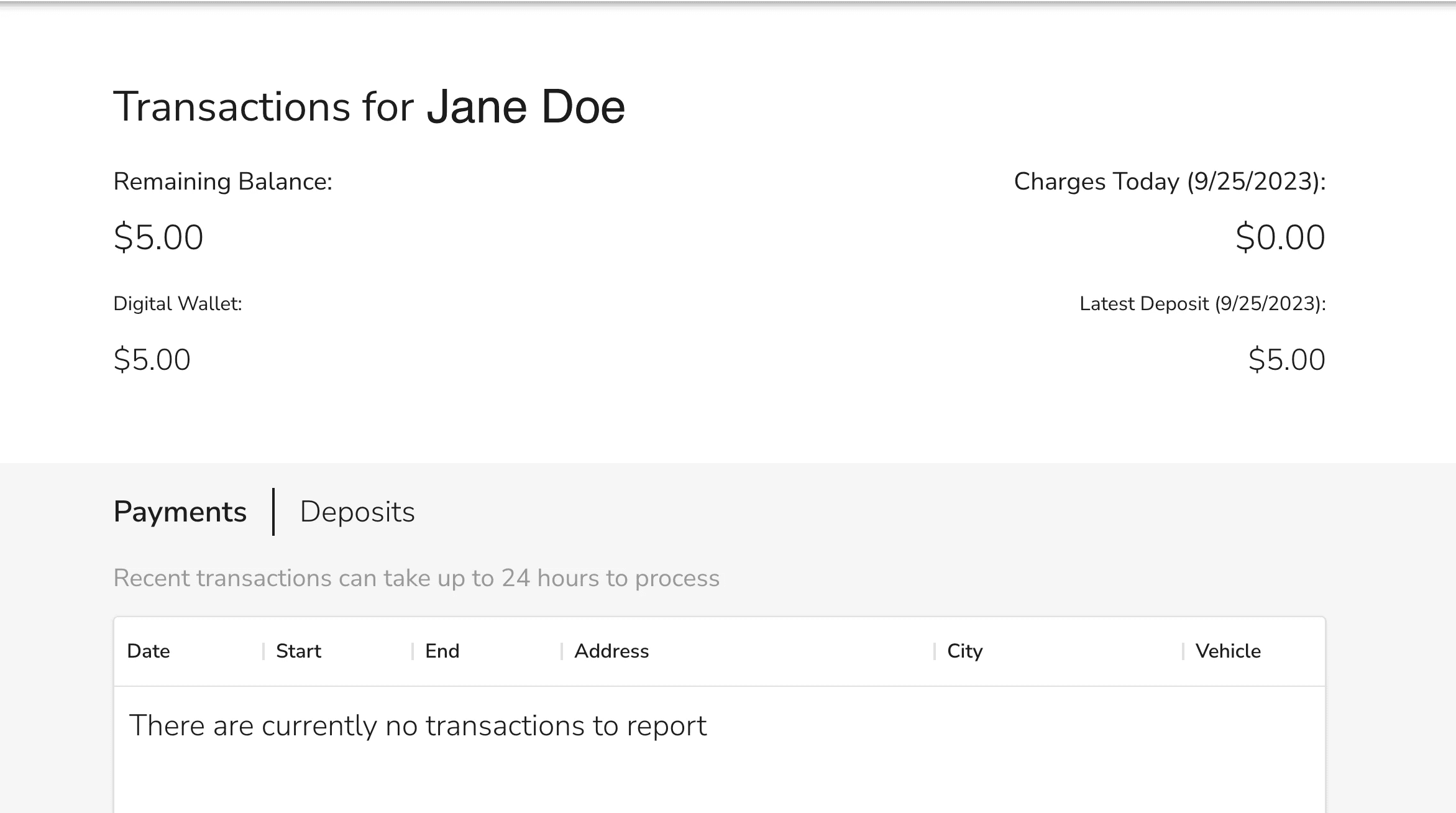
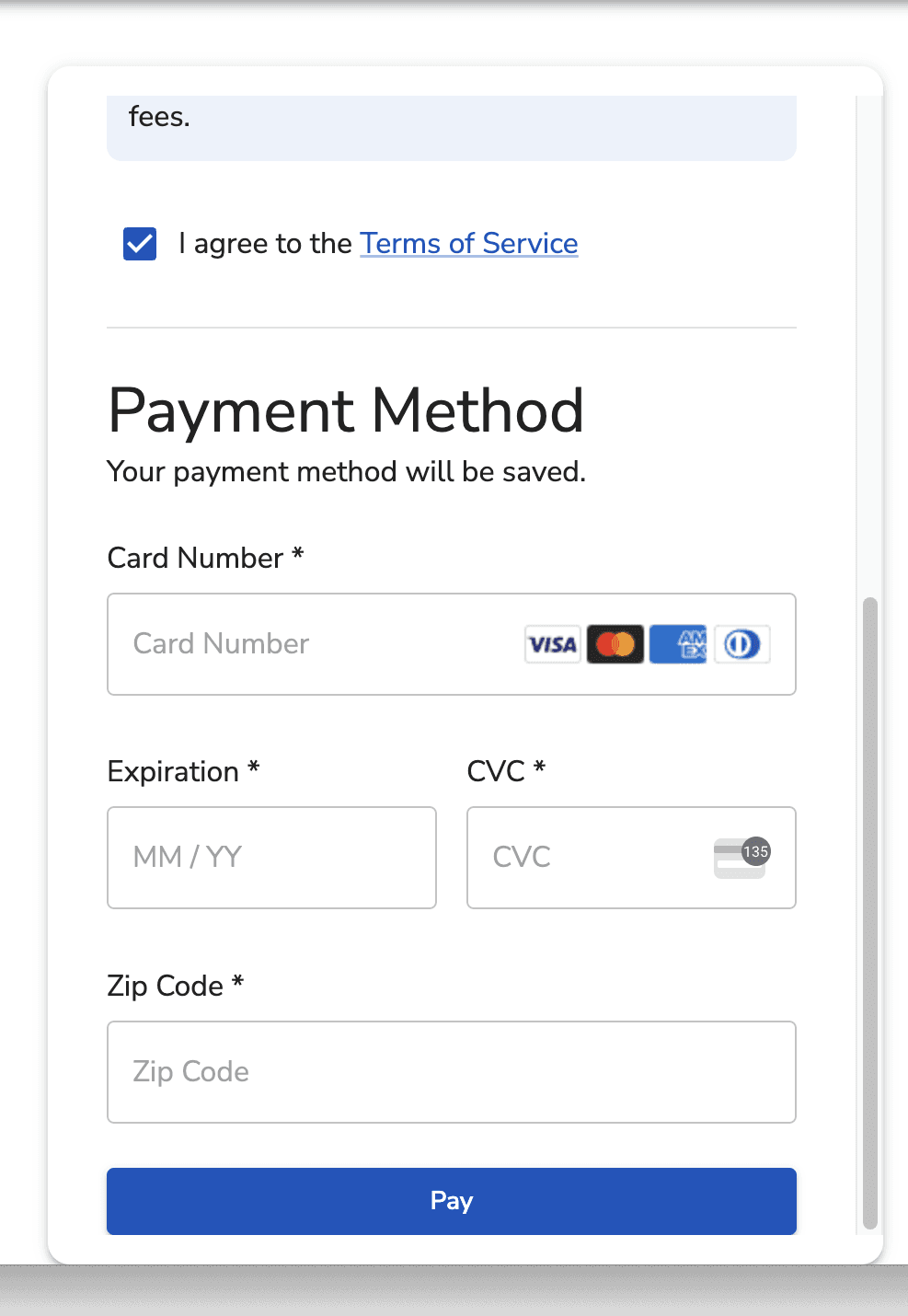
Hi-Fi Prototype: Application
After usability testing, we refined the high-fidelity prototype to address key usability issues surfaced during testing. Updates included:
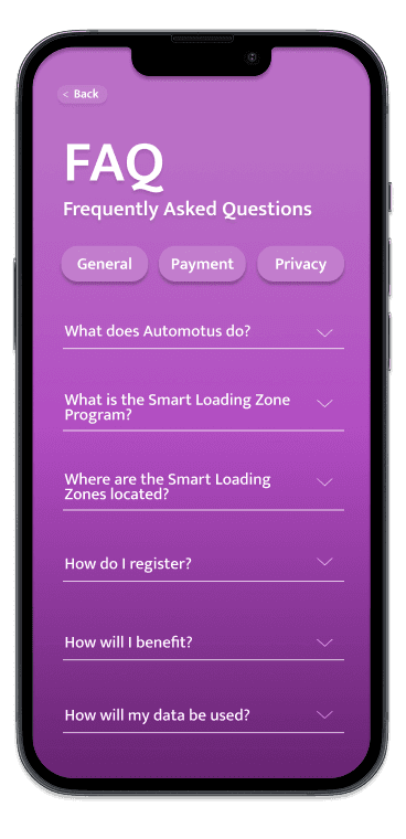
Clearer FAQ content
A more prominent “You’re All Set” confirmation state
Cleaner layout for "Pay Now" or "Pay Later"
Improved color contrast for readability

SYSTEM DESIGN
Lo-Fi Signage Prototype: In-Person & Remote User Testing
We tested our signage concepts through both in-person and remote sessions with ten college-aged and older drivers. Participants were shown two prototype signs designed to challenge different assumptions.
To test whether users would choose Tap-to-Pay over QR-based registration, we created a sign that presented both options and observed which participants selected.
To test whether clearer privacy information increased comfort, we introduced a version of the sign with explicit privacy messaging and asked participants to rate their comfort level.
This allowed us to evaluate not just preference, but perceived risk and confidence.
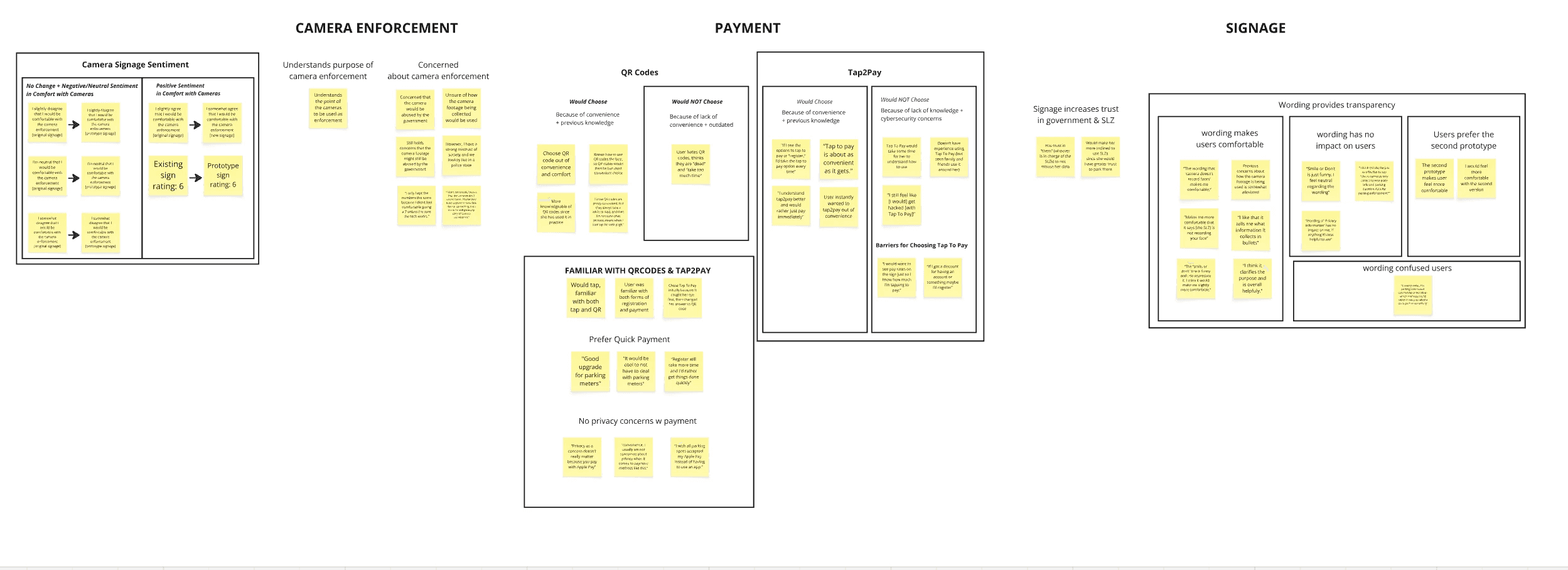
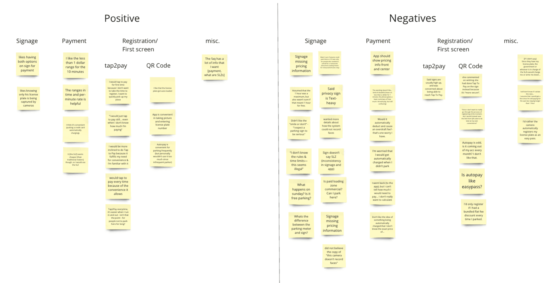
Across testing, participants consistently preferred Tap-to-Pay over QR-based registration. Many described it as faster, more convenient, and more familiar. While some participants expressed initial concerns about using Tap-to-Pay, those concerns were outweighed by the ease and clarity of the interaction. Affinity diagramming helped us identify patterns across feedback and confirm that perceived technological risk was lower than the cognitive cost of registration.
Lo-Fi Usability Testing - Affinity Diagramming
Using these HMWs, the team moved into ideation using the Crazy 8’s method. For each HMW, team members rapidly generated ideas to explore the breadth of possible solutions before converging.
To make sense of the large volume of ideas, we grouped concepts into broader solution categories and evaluated them based on:
Alignment with BootUp’s values
Potential impact on educator and student needs
Feasibility within the project timeline
Through team voting and discussion, ideas were consolidated into three primary solution categories.
SYSTEM DESIGN
Application Prototype: Think Aloud Protocol & Usability Testing
We conducted in-person usability testing with eight college-aged and older drivers using a think-aloud protocol. Participants were asked to verbalize their thoughts as they completed three scenarios:
First-time parking in an SLZ
Short-term parking
Longer-term parking
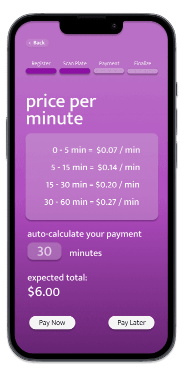
This allowed us to observe where users hesitated, felt reassured, or became confused. Affinity diagramming revealed that pricing clarity, privacy messaging, and visible progress were critical to reducing anxiety and supporting confident completion.
We found many negatives in regard to the web app and signage of our prototype namely being the pricing information, the privacy warning, and the convenience of calculating pricing/time. Our team set out to revise the information accordingly.
Usability Testing - Affinity Diagramming
Using these HMWs, the team moved into ideation using the Crazy 8’s method. For each HMW, team members rapidly generated ideas to explore the breadth of possible solutions before converging.
To make sense of the large volume of ideas, we grouped concepts into broader solution categories and evaluated them based on:
Alignment with BootUp’s values
Potential impact on educator and student needs
Feasibility within the project timeline
Through team voting and discussion, ideas were consolidated into three primary solution categories.
SYSTEM DESIGN
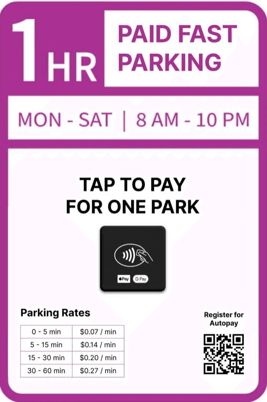
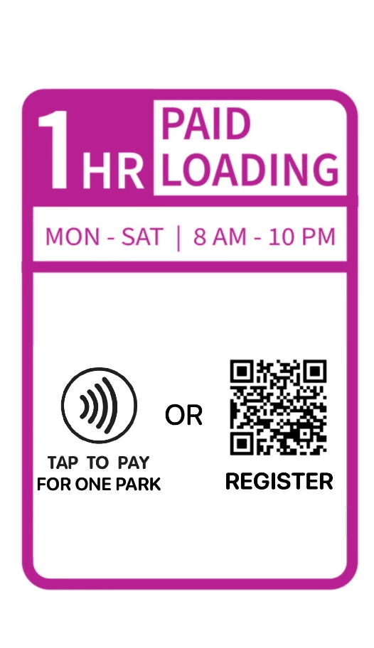
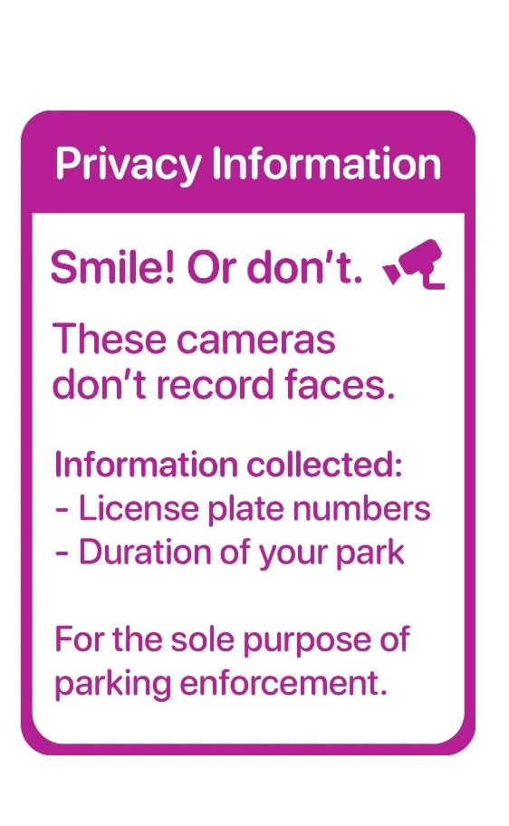
Hi-Fi Prototype: Signage
The final signage design placed Tap-to-Pay front and center, eliminating unnecessary registration barriers. Pricing, duration, and eligibility were clearly visible, allowing users to decide and act quickly.
Supporting privacy information provided reassurance about camera enforcement without overwhelming users. Together, these changes reduced perceived risk while maintaining the city’s enforcement model.
Using these HMWs, the team moved into ideation using the Crazy 8’s method. For each HMW, team members rapidly generated ideas to explore the breadth of possible solutions before converging.
To make sense of the large volume of ideas, we grouped concepts into broader solution categories and evaluated them based on:
Alignment with BootUp’s values
Potential impact on educator and student needs
Feasibility within the project timeline
Through team voting and discussion, ideas were consolidated into three primary solution categories.
Our team observed the currently implemented solution for ourselves before moving on to heuristic evaluations.
Exploring SLZ Signage and App Registration
Research
Current Signage at Purple Curbs
Current Application & Workflows